


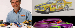
Meet Larry Wood: The man whose designs launched a million hot rod dreams
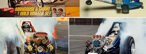
Can you imagine a toymaker designing your Top Fueler? 'Snake' and 'Mongoose' could
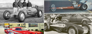
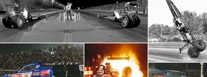
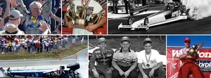
For the love of old drag racing photos
The ultimate Funny Car winners quiz
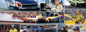
Still popular after all these years: Catching up with fan favorites Eddie and Ercie Hill
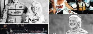
Eddie Hill, the early years
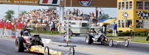
55 years ago, Don Garlits forever changed the look, feel, and future of Top Fuel racing
On a roll: A look at some all-time great NHRA Drag Racing success streaks
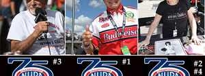
NHRA's Top 75 Moments: Bernstein, 'Big,' and Shirley reflect on making history
Funny Car set to turn 1,000: A look back at the milestone races along the way
Beyond the Top 75s ...
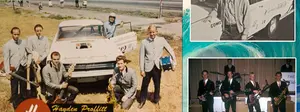
Wait ... Jim Head was in a 1960s surf band promoted by a drag racing legend? Yep.
More Martin memories
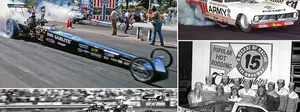
The Popular Hot Rodding Championships put U.S. 131 in the national spotlight
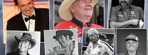
Friends we lost in 2025
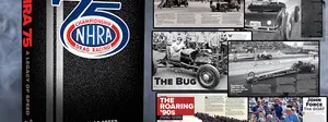
Re-telling NHRA history: The 75th anniversary book and other special projects
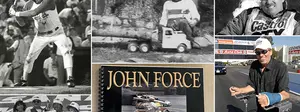
It was John Force's world, and we were all thrilled to be living in it
The Joyce of Drag Racing Photography
Two legends: 'Big' and Bakersfield
When did we start doing that? Tracking some of the biggest changes in our sport
From 10-time dominators to one-time winners, a history of Indy Top Fuel champs
Legend to legend: Don Prudhomme on Don Garlits, Indy, and other great takes
NHRA Rookies of the Year: A look back at where some fabulous careers began
NHRA national event history: A look at the tracks and stories that drove the sport
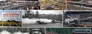
The Northwest Nationals has historically put the 'great' in Great Northwest
Larry Minor was a major player
How the early 1980s shaped NHRA's future
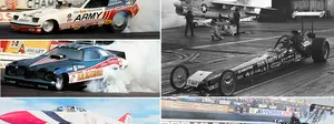
A Memorial Day salute to armed services sponsorships in NHRA history
Top Fuel A to Z: The quest to compile a list of every driver to compete in NHRA
Top Fuel, A to Z: The complete list
Five Fabulous Favorite Fotos ... er, dandy drawings
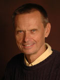 |
I'm going to throw a slight change up at you for this week's Five Fabulous Fotos and deliver a dandy dose of drag drawings from our own in-house artist, John Jodauga. J.J., who was part of the staff at DRAGSTER in the 1970s, left us to open his own advertising agency. He returned to us some 20 years later, in 1993, and his words and occasional drawings have been a part of ND since. Here's John's story and favorite drawings, in his own words.
“Ever since I can remember, I used to copy drawings from comic books that my mother bought for me, and they included such subjects as Peter Pan and Captain Hook, Prince Valiant, and Davy Crockett. After the Brooklyn Dodgers relocated to L.A. in 1958, I began making drawings of my favorite baseball players, and later had some sports drawings published in local newspapers such as the Pomona Progress Bulletin and the Claremont Courier. But ever since I attended my first drag race at the 1964 Winternationals, it has been quarter-mile vehicles and their drivers ever since.”
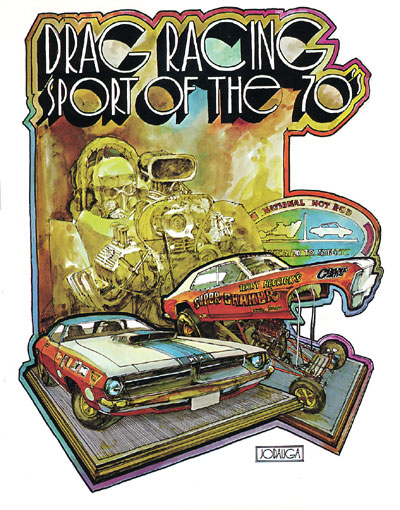
| "What makes this illustration a personal favorite is the fact that it was probably my first commissioned full-color painting. Previously, most of my drawings were done in black and white with pencil or pen and ink, and just occasional spots of color added for accent. Wally Parks asked me to do this prior to the start of 1970's NHRA Super Season, in which the national event schedule expanded from four to seven races, something that the entire organization was very excited about. The concept was to represent the Top Fuel cars, which had been around since day one, in a flat pattern with monotone sepia colors. The Funny Cars, which had just become a full-time NHRA eliminator in 1969, and the Pro Stockers, which were making their debut in 1970, were to be drawn in a more three-dimensional style and in full color to promote their status as relatively new attractions to the sport.
"I was given a week for this assignment, but after spending the first six days on rendering just a small portion of the dragster, I had to pull an all-nighter to get it finished. This, to the consternation of many art directors that I later worked with, established my working habits for much of my career but there was always something very stimulating and invigorating in completing the final stages of a painting just as I watched a picturesque sunrise outside the window.” |
 |
|
|
|
| '“Probably the most enjoyable series of paintings I was ever associated with, in terms of latitude of creativity and just having a great time doing them, were the press kit covers that for Bill “Grumpy” Jenkins from 1970 to 1978. The first two or three examples were very straightforward with the simple combination of a face and car shot, but I got the idea that it might be fun to put Jenkins in situations somewhat unlike the “Grumpy” persona that he had cultivated for so many years.
"Following Jenkins’ virtually undefeated season in 1972, I thought that a Superman comic book cover would be a natural for 1973, but it took a month to talk him to it. After mostly positive feedback, he was more receptive to other concepts that followed. For the 1974 'Grumpy Rides Again,' I rented a cowboy outfit from Western Costume Supply Co., which provided everything from Roman togas to Civil War uniforms to Hollywood motion picture studios. We shot the pictures during the 1973 Supernationals at Ontario Motor Speedway, where the Pro Stock teams had access to the facility’s enclosed garages. I suggested to Jenkins that we could take the pictures inside the garage, but he insisted that we do them outside in the pit area. As soon as he walked out the door in his cowboy regalia, complete with the 20-gallon hat, a huge crowd began to gather, and it swelled to about 500 people who began taking their own pictures. Jenkins enjoyed every minute of hamming it up before the fans, an aspect of his personality that was rarely seen. Each of these covers was painted well before the advent of computer graphics, and virtually all of the lettering was done by hand.” |
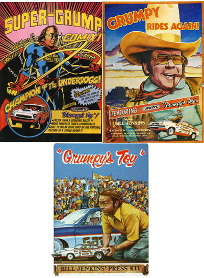 See bigger :Super-Grump | Grumpy Rides Again | Grumpy's Toy |
|
|
|
| "There were several other racers for whom I did press kit covers, including Don Prudhomme, Barry Setzer, Bob Glidden, Don Nicholson, Paul Blevins, and Gary Gabelich. In this example, for the Blue Max Funny Car team of Raymond Beadle and Harry Schmidt, I eliminated much of the ink outlines that I usually drew around each subject matter. I felt it made it more of a painting rather than an illustration. It was always enjoyable to work with cars that had colorful paint schemes like the Blue Max, and the photograph that I worked from gave me lots of great areas for rendering the reflections of the sky on the hood, roof, and other surfaces of the car." | 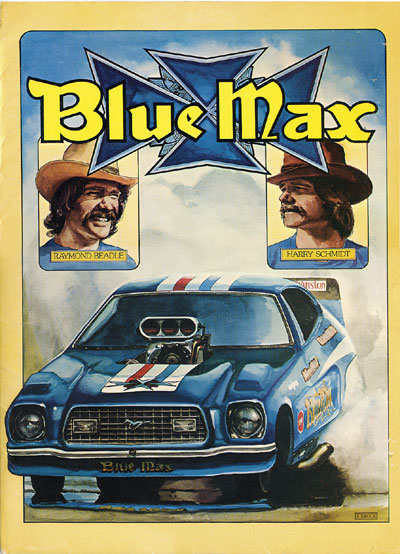 |
|
|
|
| "Through the years I was fortunate to be given assignments that were associated with many of drag racing’s milestone performance achievements. This included doing portraits of the original 16 members of the Cragar 5-Second Club, Kenny Bernstein breaking the 300 mph barrier, and Warren Johnson recording the first 200-mph Pro Stock run. I took particular enjoyment in doing the poster for Kurt Johnson as the first member of the Holley 6-Second Pro Stock Club, because I was in Englishtown to see it happen. What really sticks out in my mind about that run was watching Greg Anderson, then the crew chief for Kurt’s father Warren, jump in the air after Kurt had cleared the 60-foot mark. The other drivers favored to be the first in the sixes, W.J., Darrell Alderman, and Scott Geoffrion, had already made their runs and come up short, but Anderson, with his trained eye, knew after seeing Kurt’s launch that he was on his way to history, and had a five-second headstart on everybody else in cheering Kurt for his major accomplishment." | 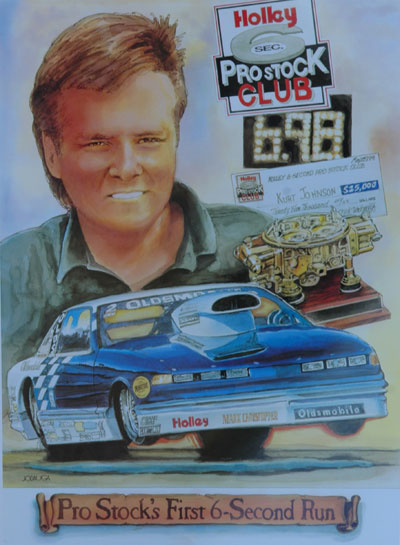 |
|
|
|
| " Having long been a big fan of Norman Rockwell, I had read in several of his books that he often used his neighbors as reference figures for many of his paintings. We used that approach as well at National DRAGSTER, such as this example of the cover for our annual Performance Predictions issue in 1996. The setting was having a uniformed and helmeted driver visit a gypsy fortune teller, with the 1995 world champs (Scott Kalitta, John Force, and Warren Johnson) peeking through the window. For the model of the fortune teller, I chose our longtime receptionist Ellen Charland, who years ago used to dress up as Snow White to greet visitors at Disneyland. She accepted the assignment with relish and provided much of the accessories for her gypsy costume. For this drawing, I wanted to recreate the atmospheric exaggerated lighting that was often seen on the covers of pulp fiction books of the 1940’s, and then-art director Jill Flores added to the effect with stylized lettering reminiscent of that era." | 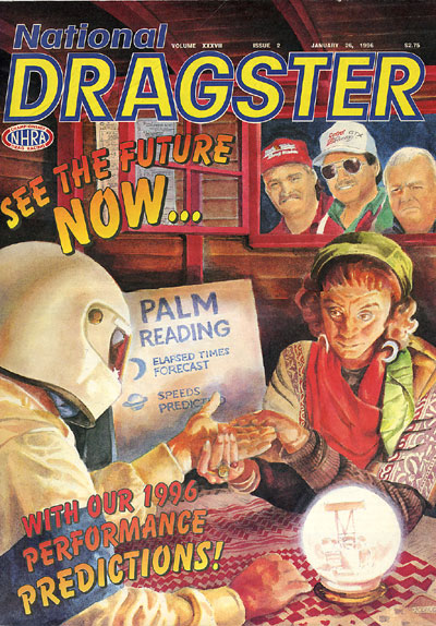 |