


Radar Charts
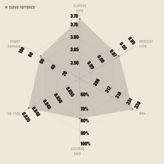
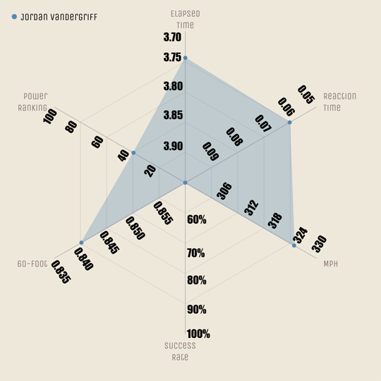
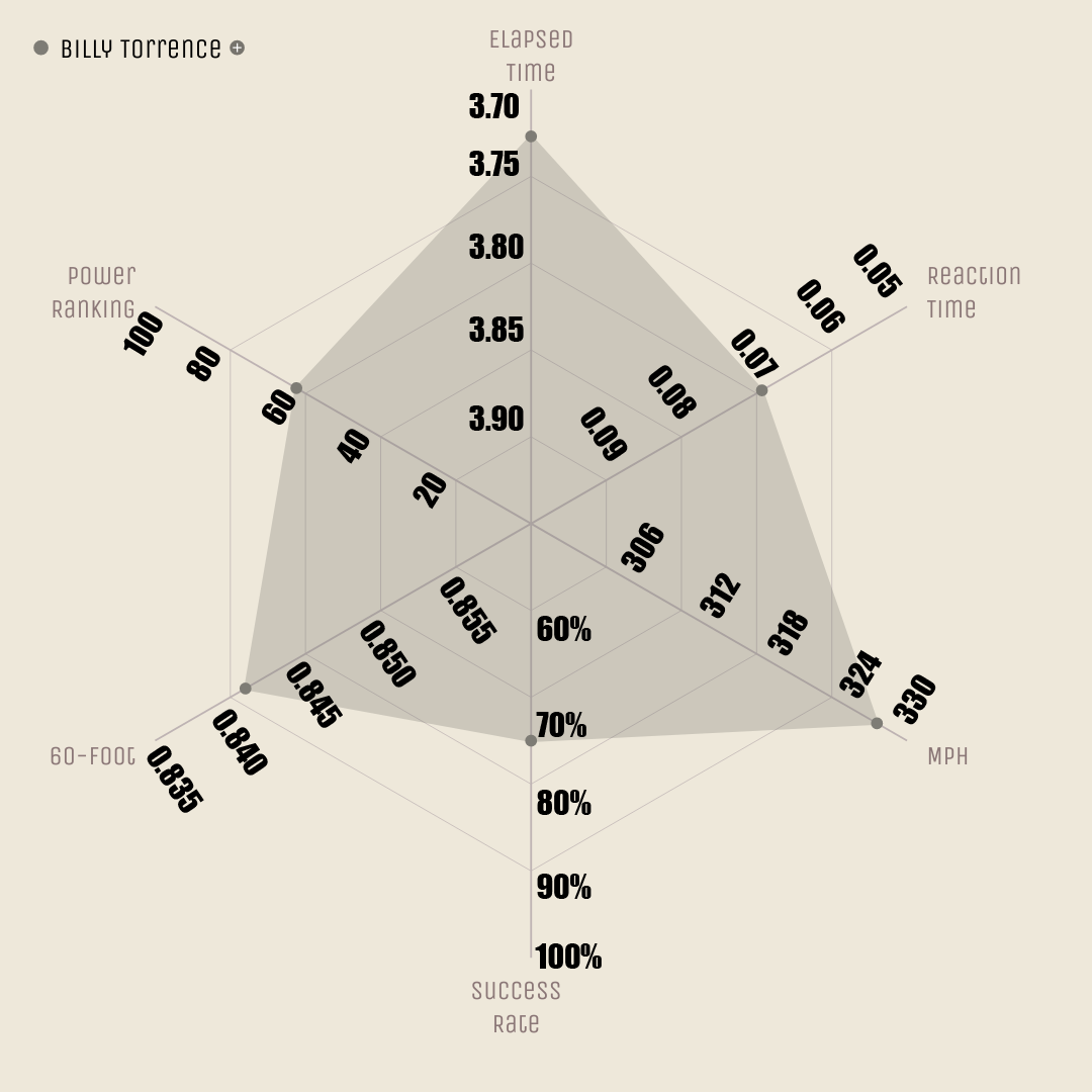
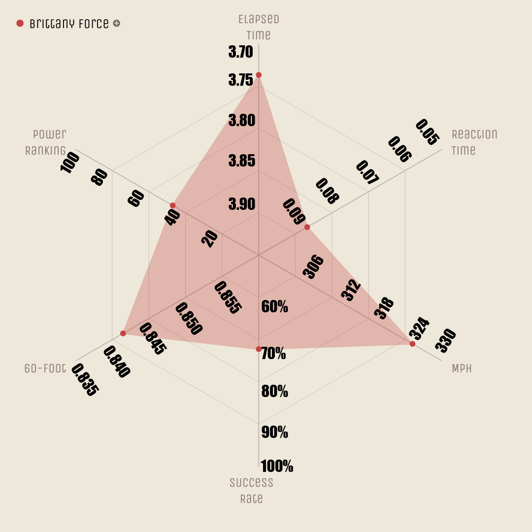
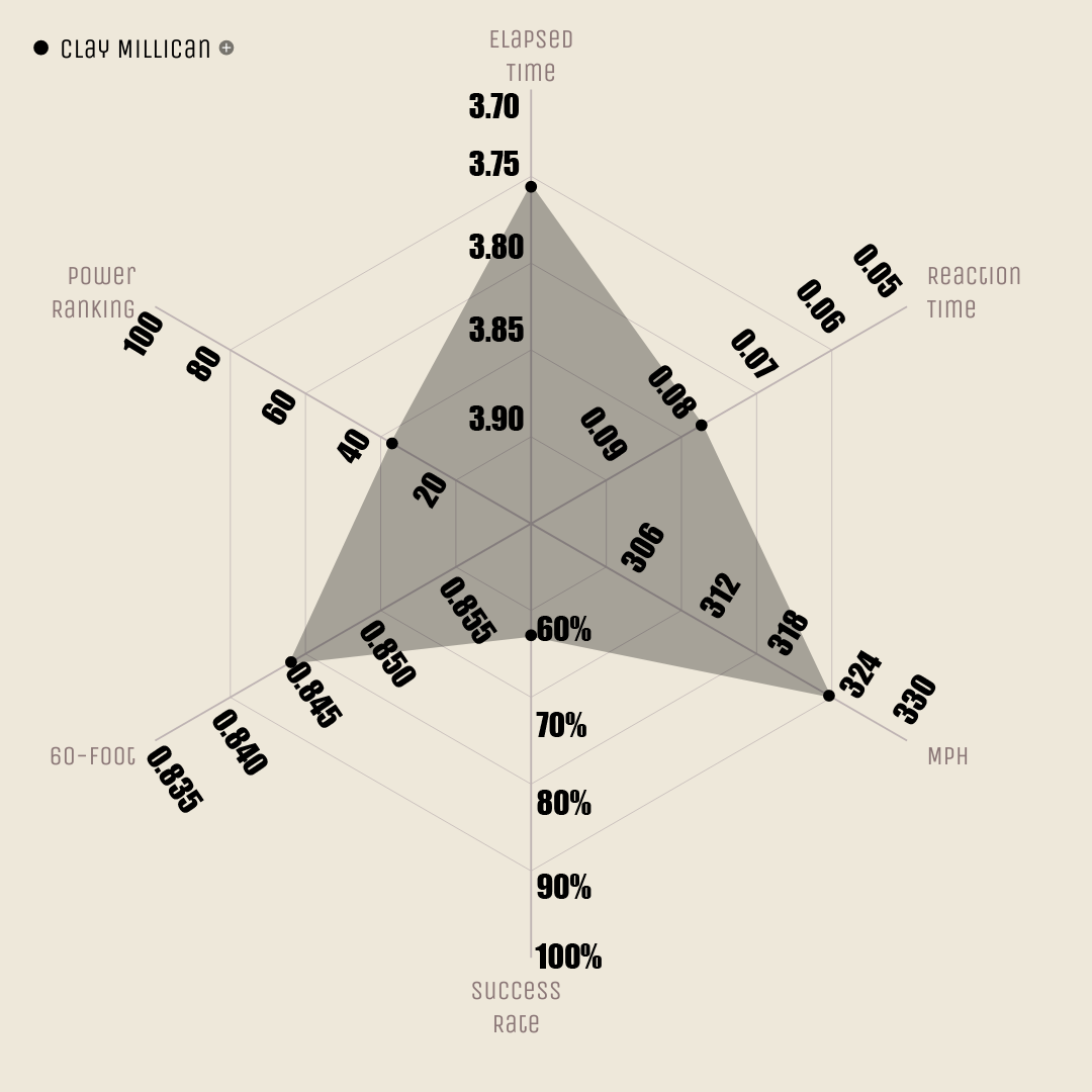
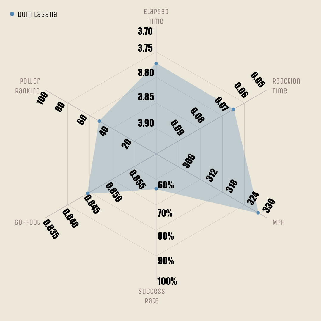
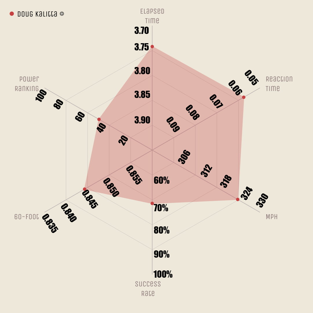
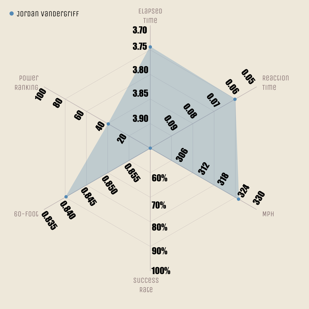
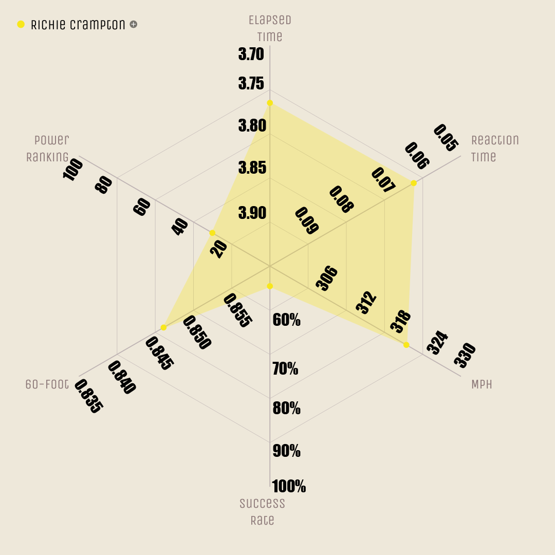
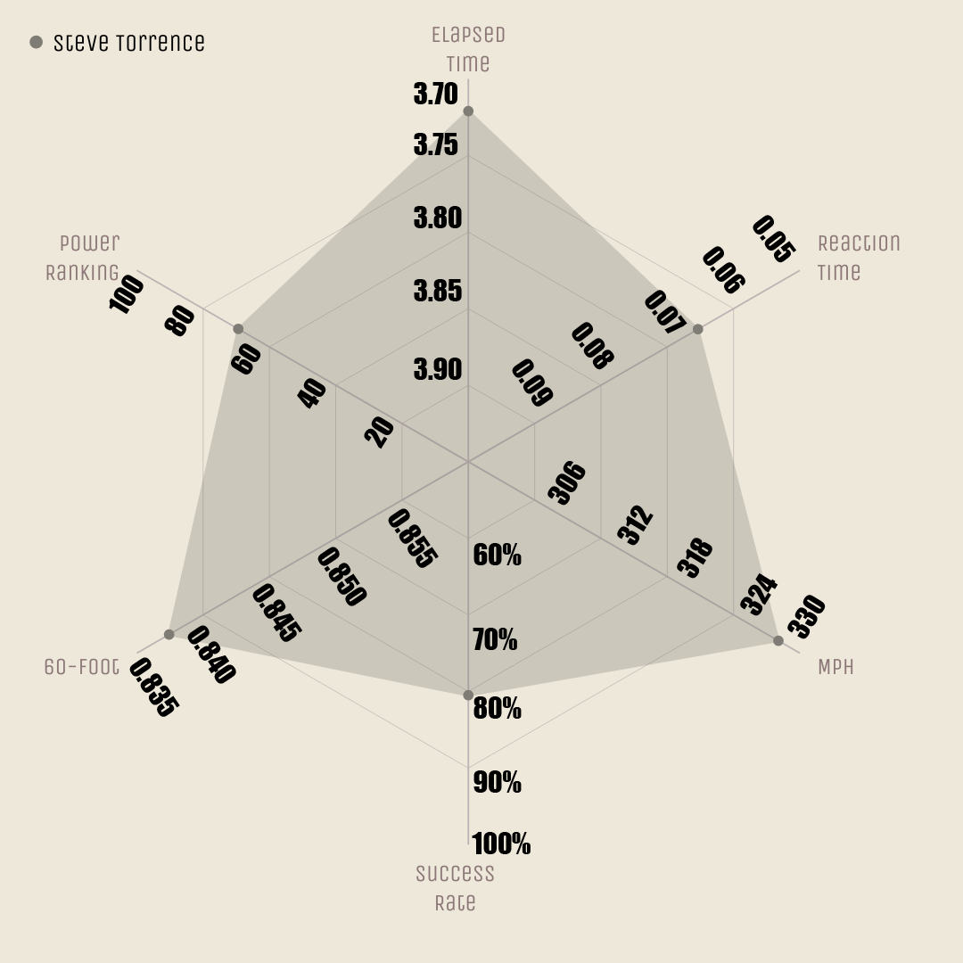
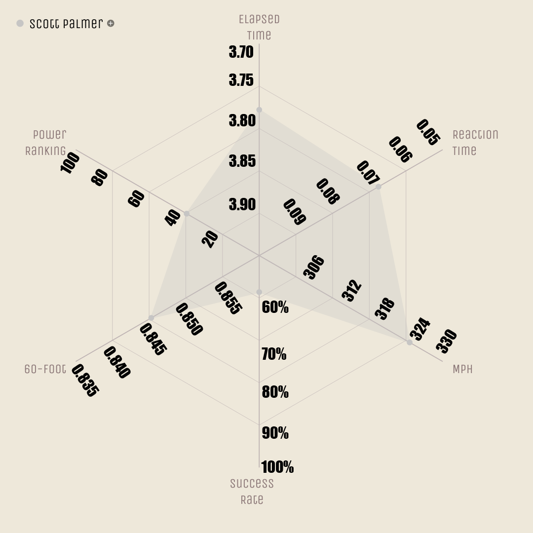
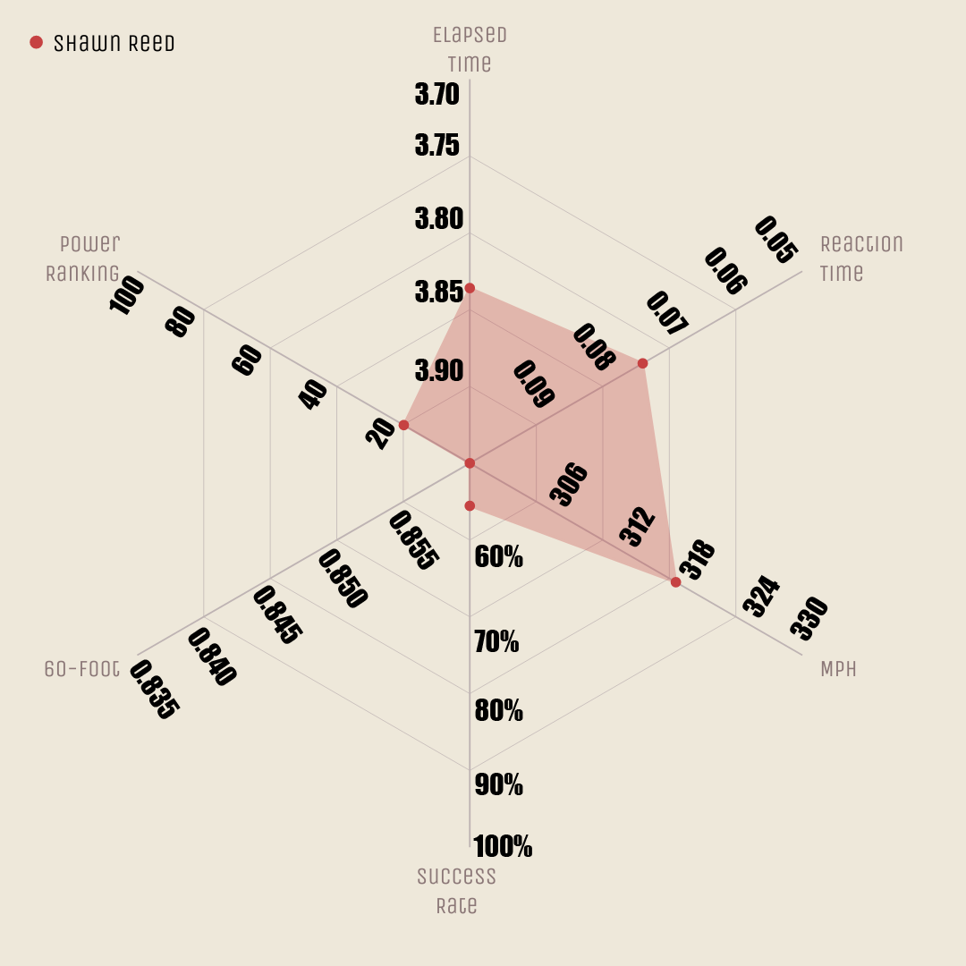
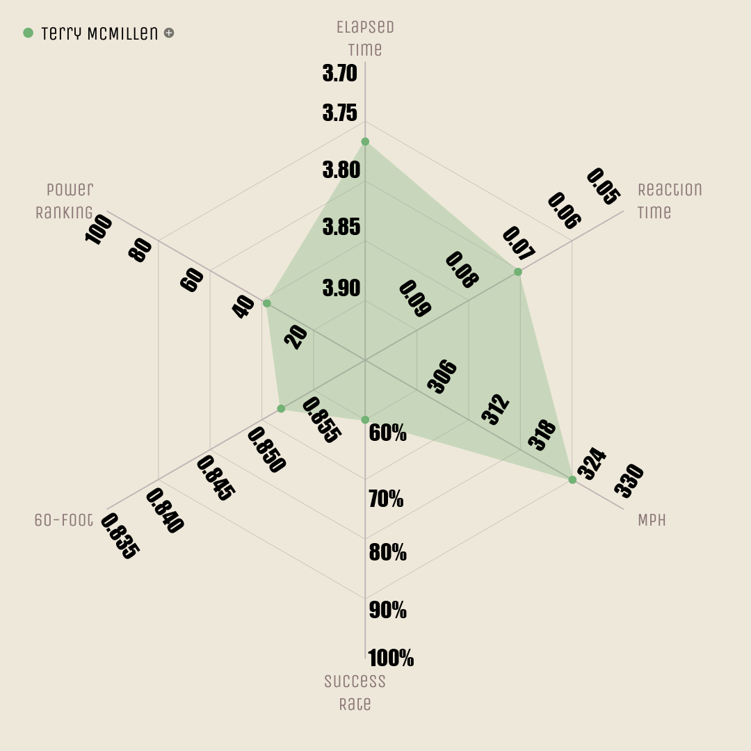
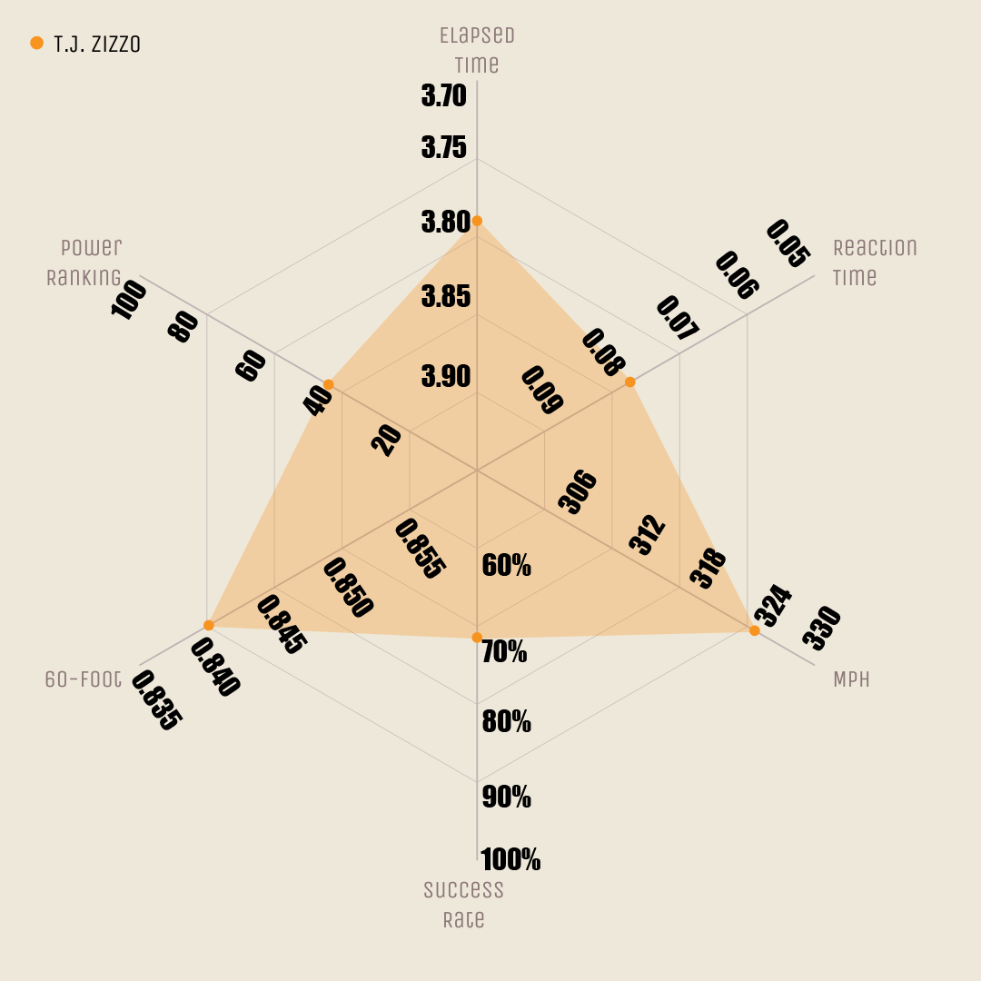
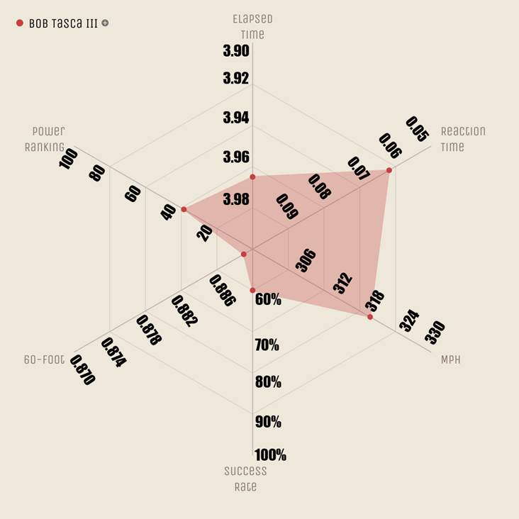
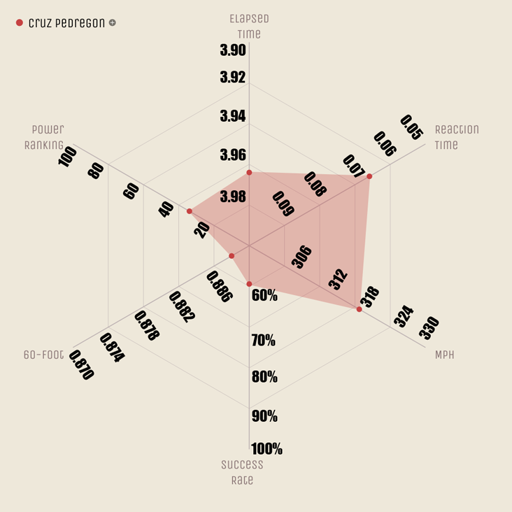
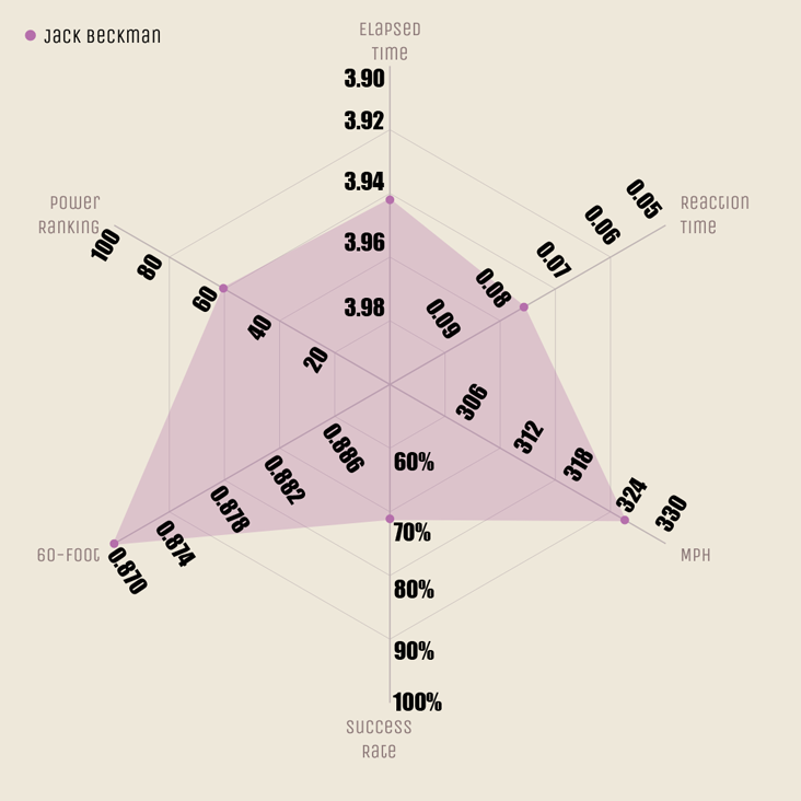
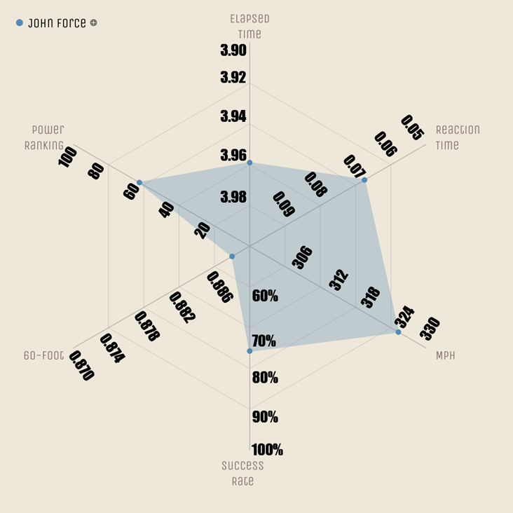
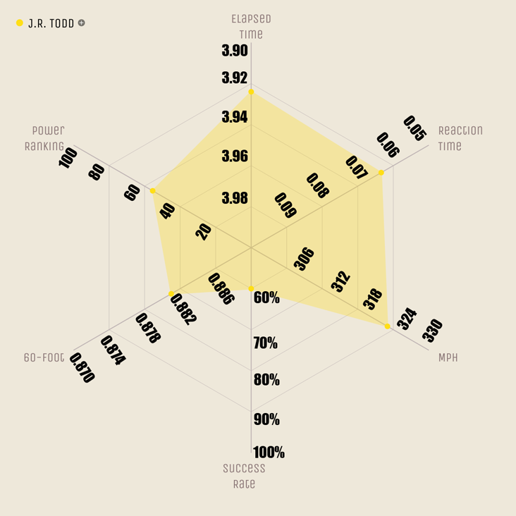
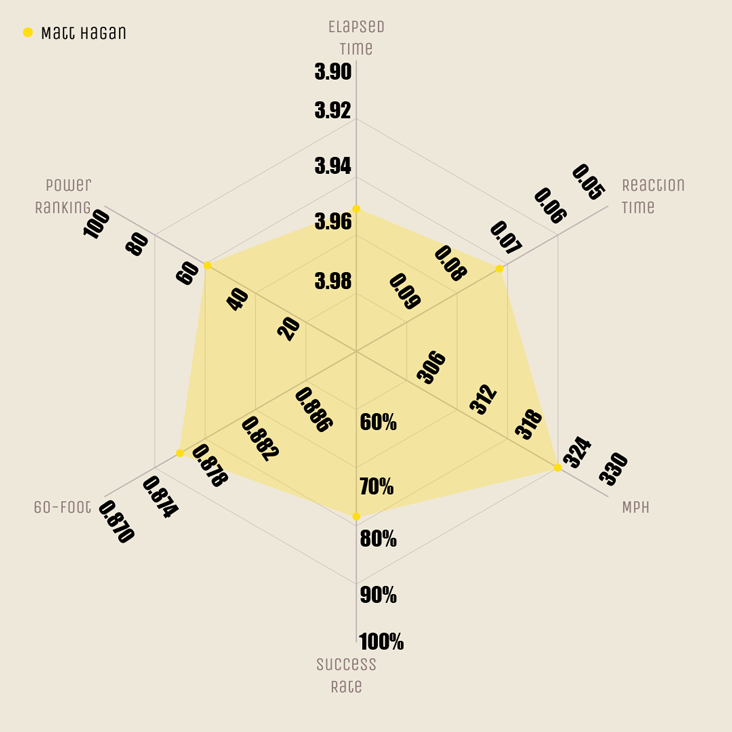
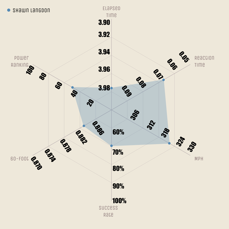
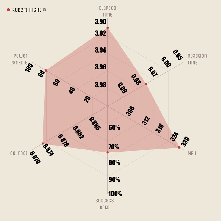
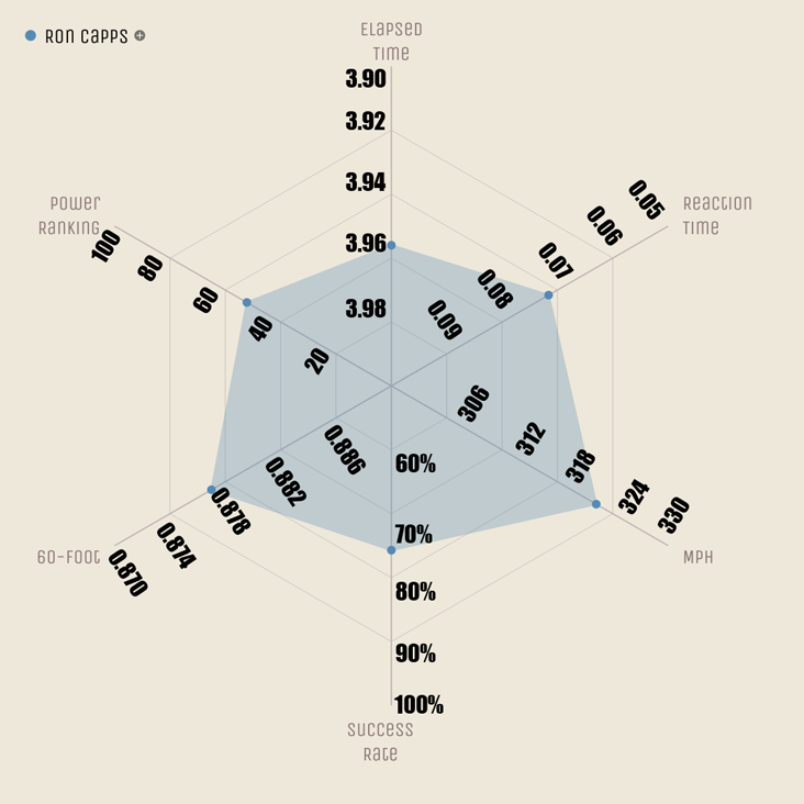
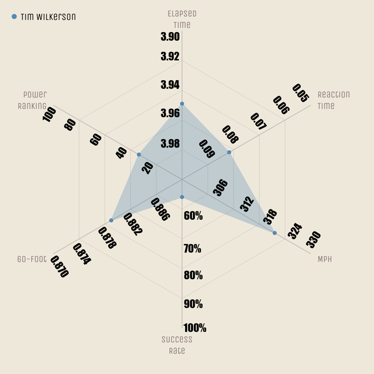
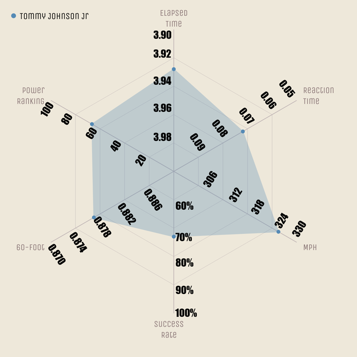
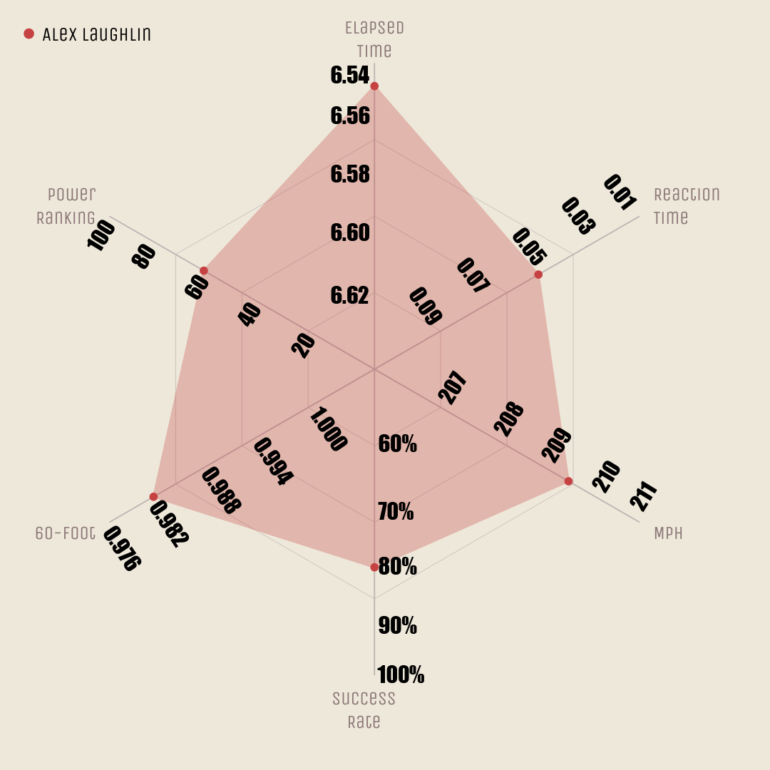
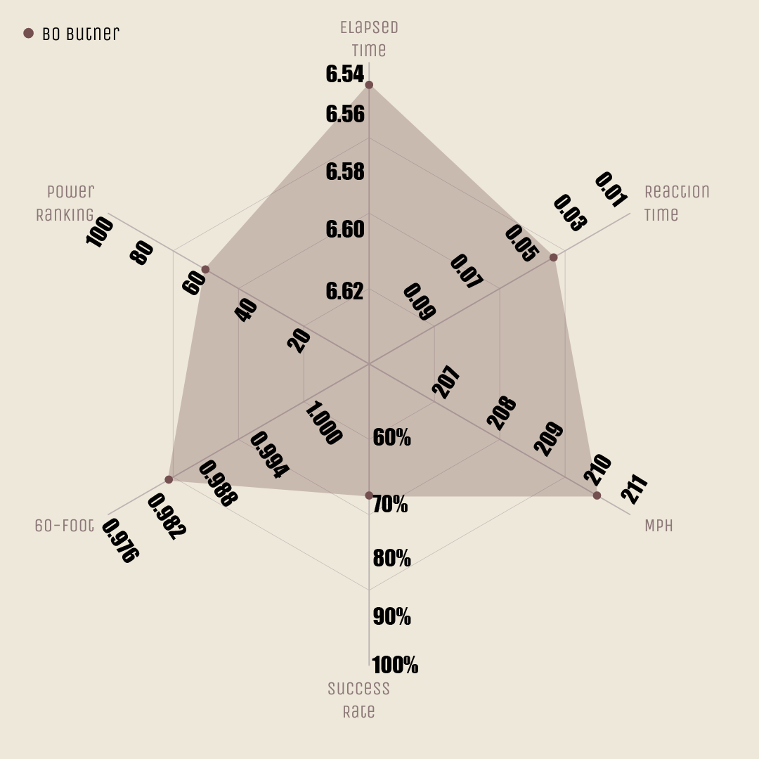
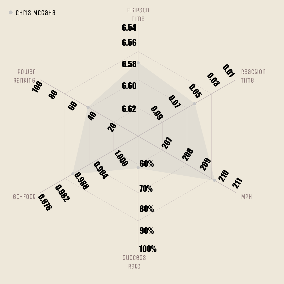
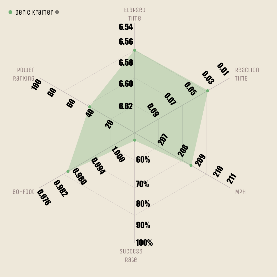
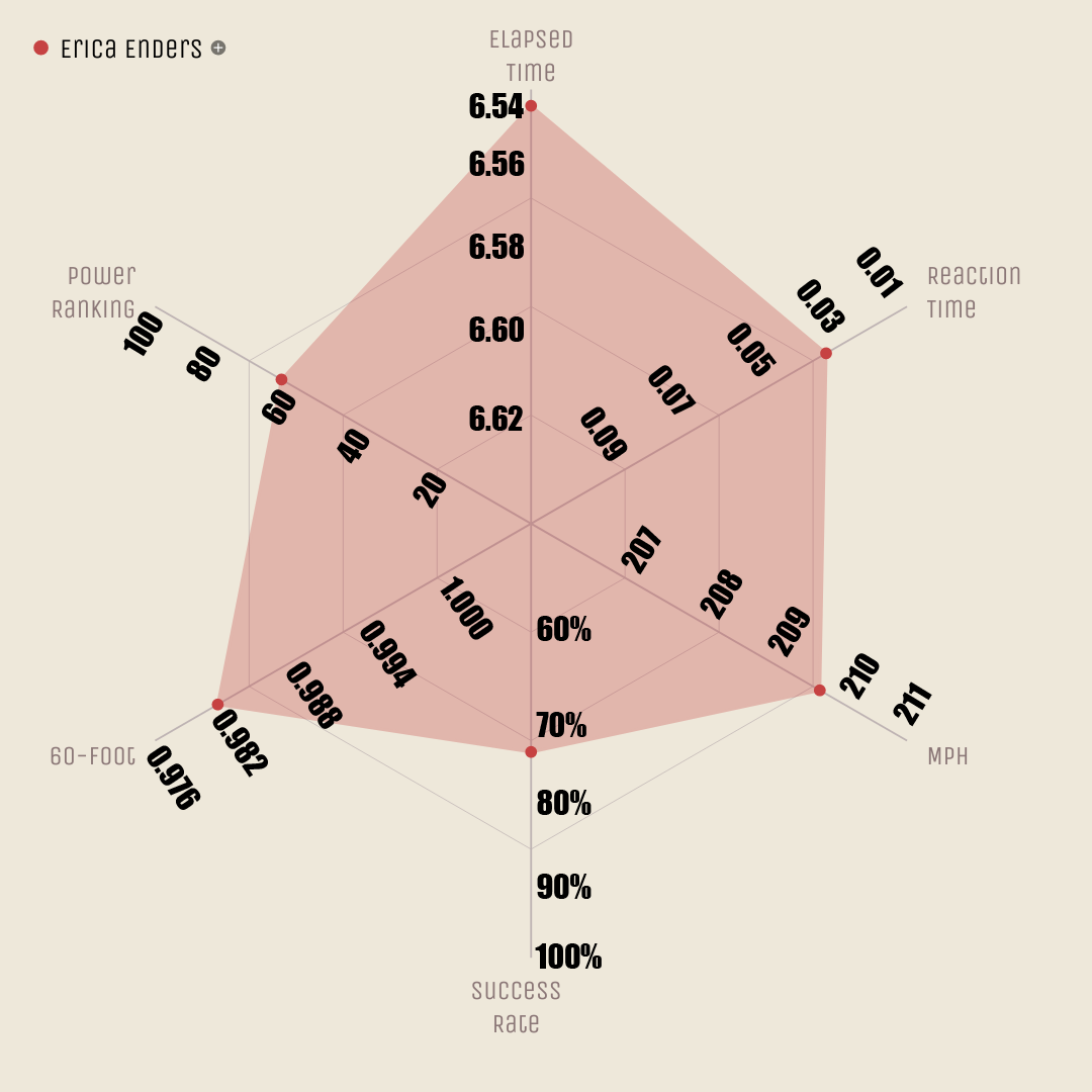
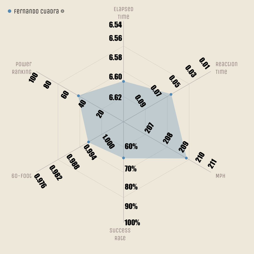
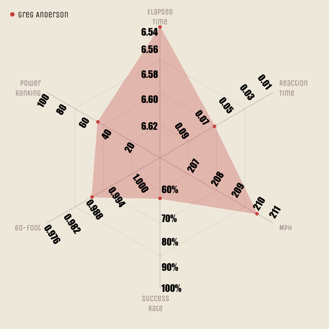
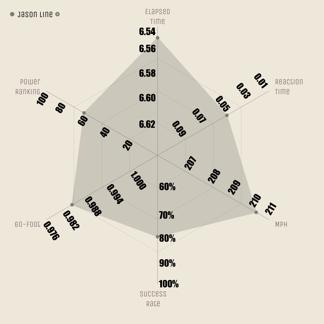
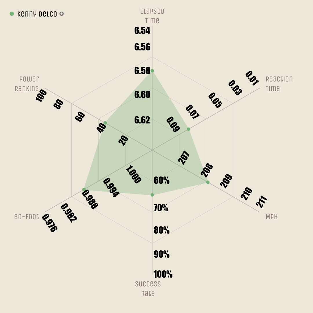
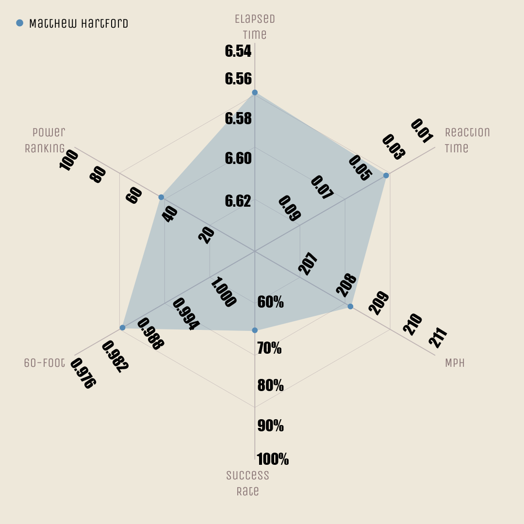
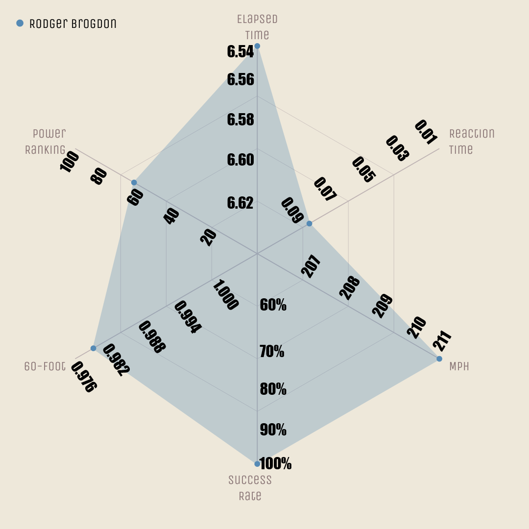
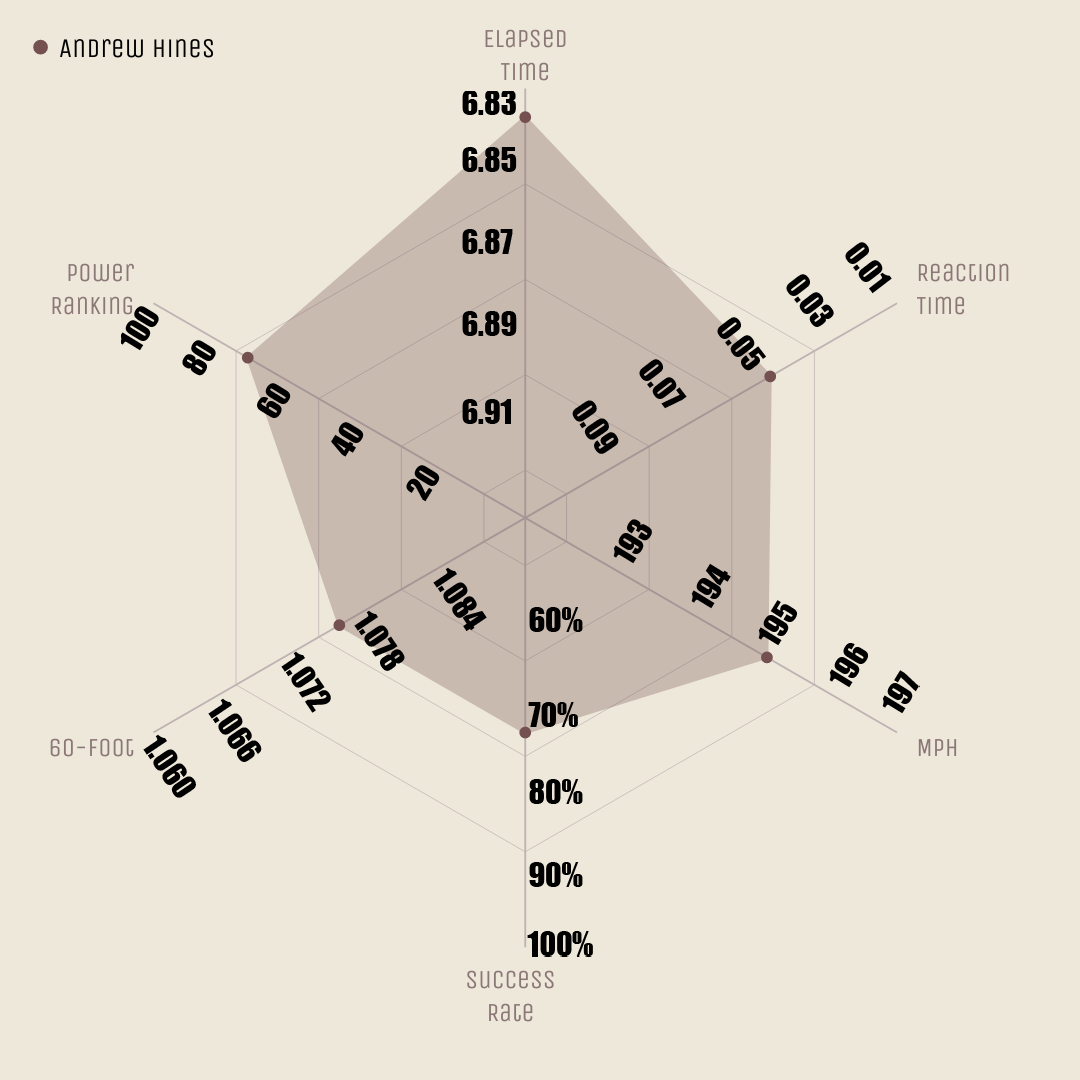
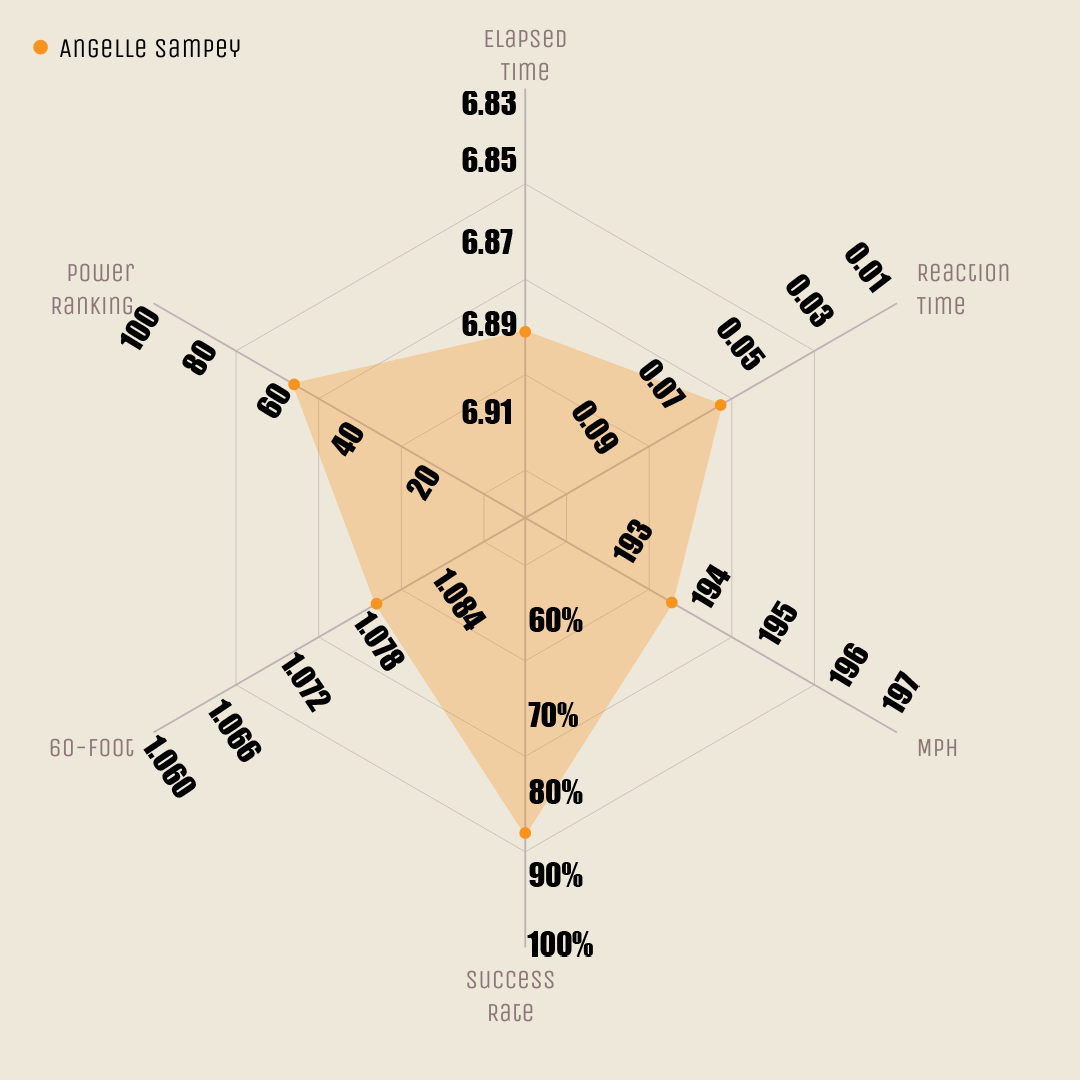
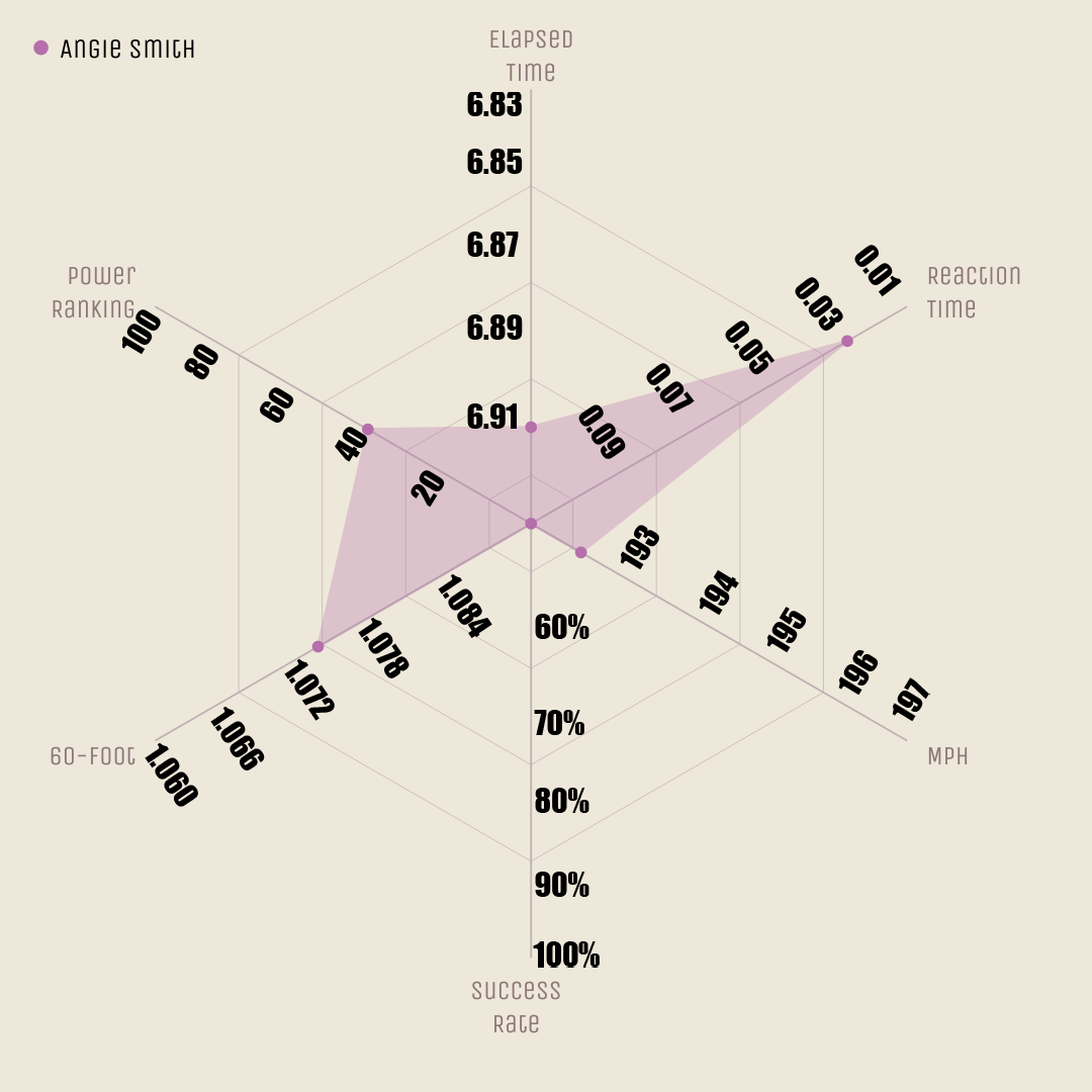
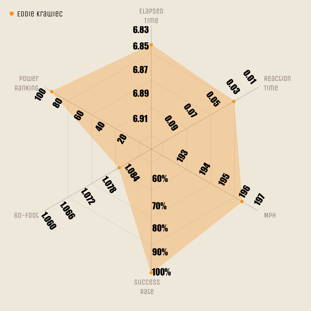
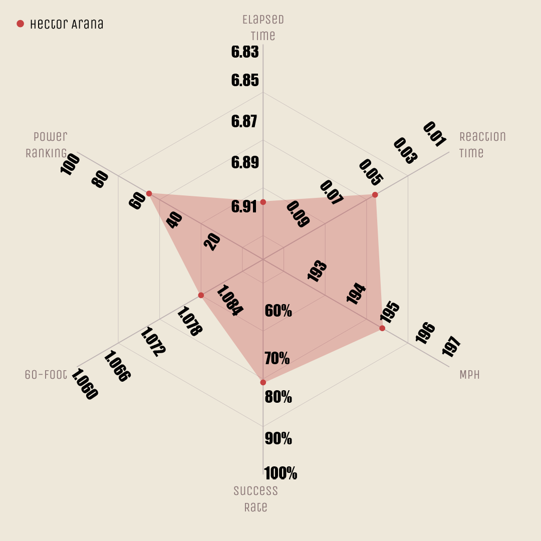
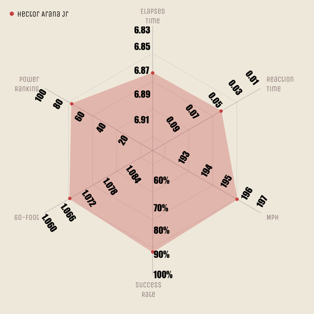
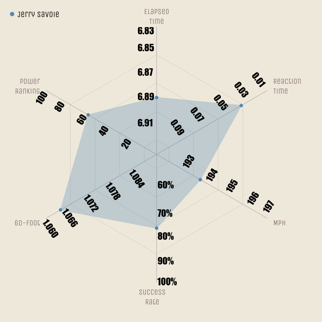
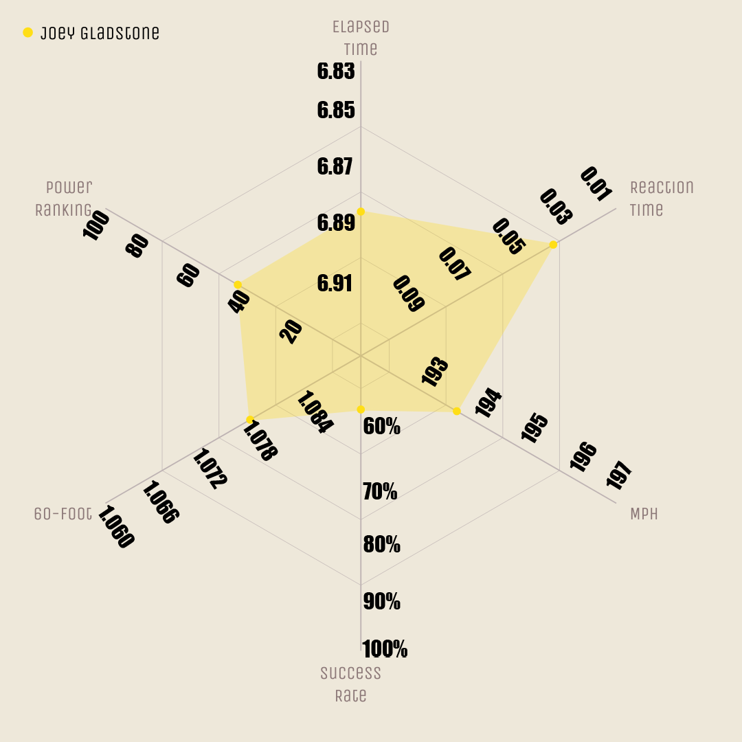
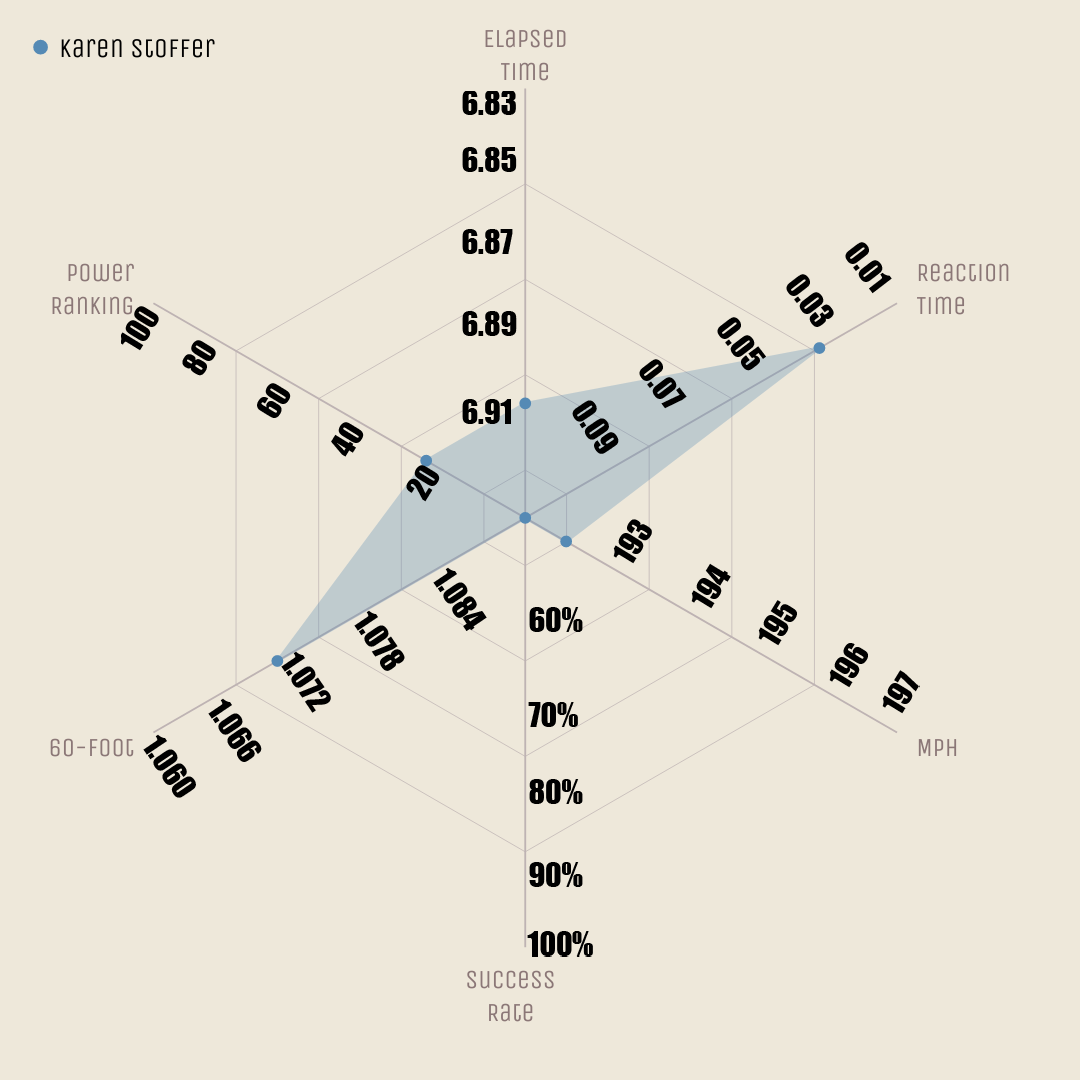
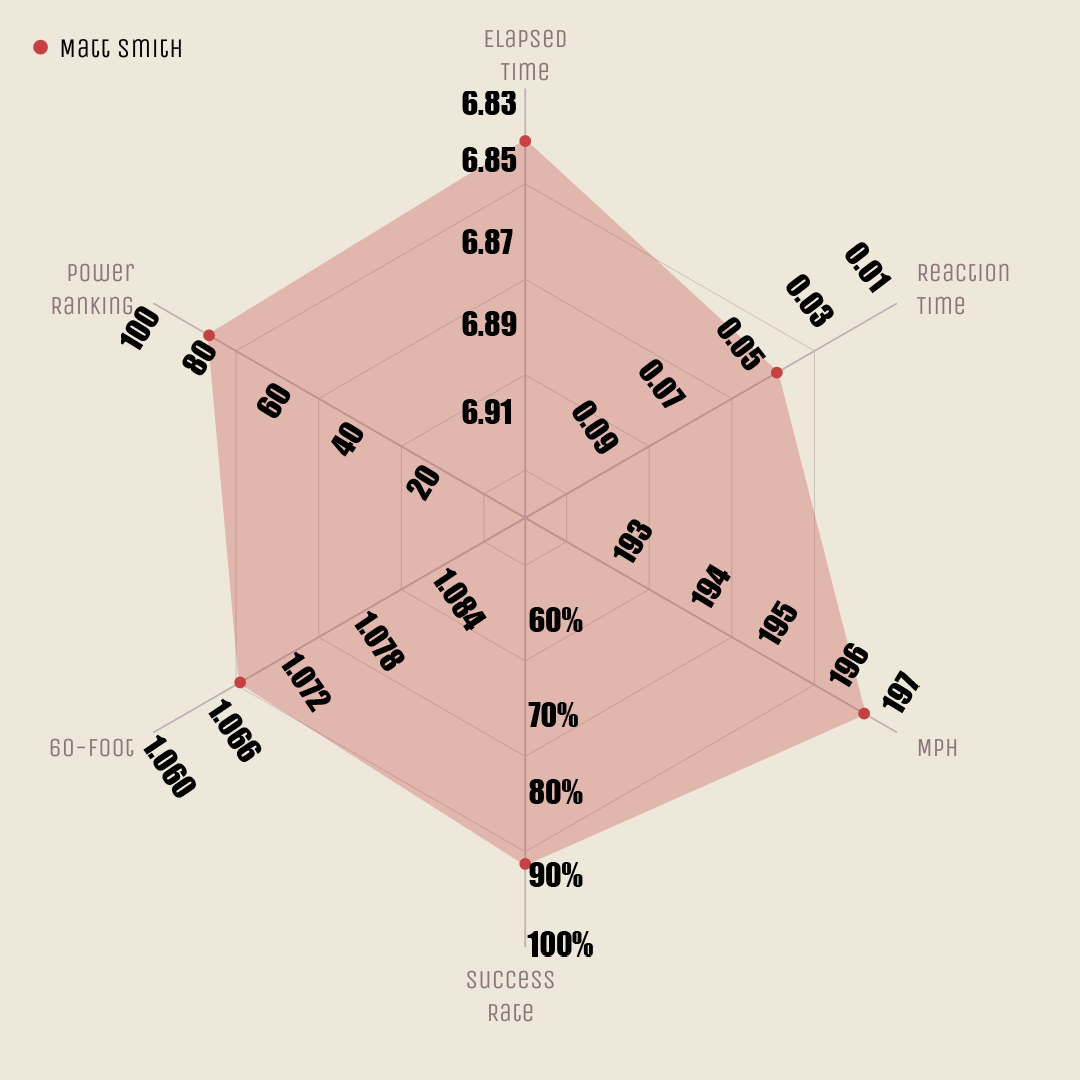
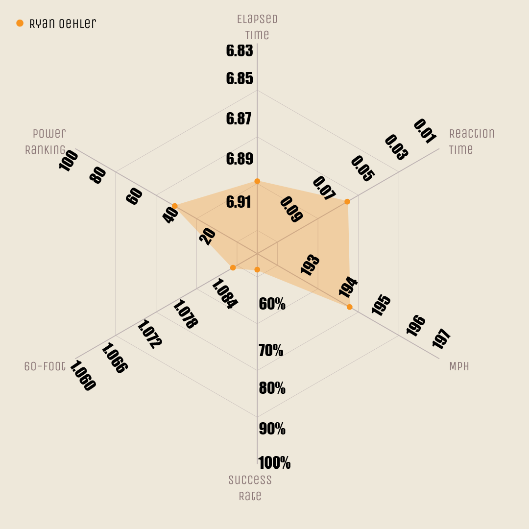
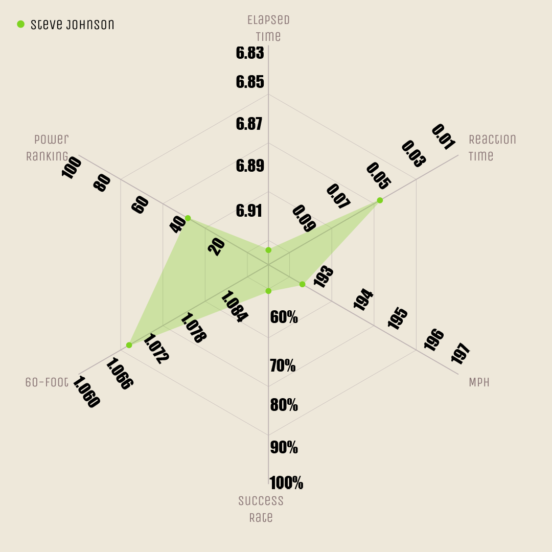
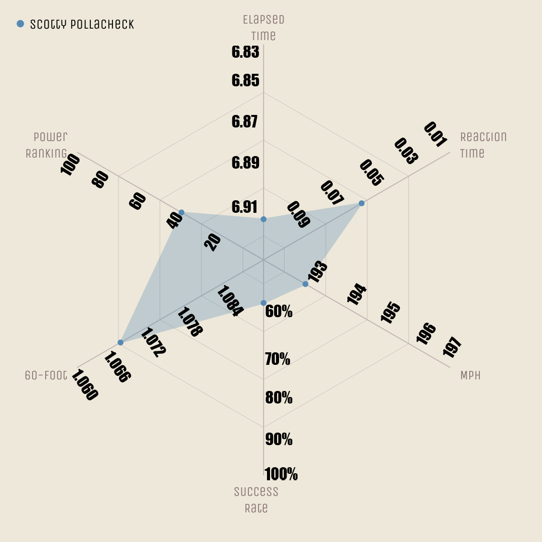
Radar charts show several statistics at the same time on one image. The below image shows Steve Torrence [really good] compared to Jordan Vandergriff [also good! Just not as good!] to give an idea of how you can compare to charts to get a quick glimpse of how two race teams compare heading into Sunday eliminations. Bigger is always better on these charts -- so the further the racer gets from the center, the better off the racer is.
It's possible to have no visible data because the center isn't zero -- it's a few rungs below average. In the interest of including as many racers as possible, but also showing a wide spread of variation, a balance had to be struck in that way. So you'll see Vandergriff doesn't have a bar for "success rate" (how often he gets down the track) -- it's not zero percent, but it's below the lowest shown number (50 percent).
No one image, number or ... well, anything will tell you everything, but this is a quick and easy way to get you close.
[Statistics include last six races]